27 Jul

Arbree Solutions: Your Trusted IT Consultant
An IT consultant is a professional individual who always provides expertise. Such an individual may work as an independent consultant. An IT consultant may also be an employee of a company or firm that offers consulting services. Arbree Solutions provides satisfactory IT services in Bangladesh. It is one of the best IT
13 Jun

A Brief Guide on Graphic Design for Creative Business in Bangladesh
Since the business has entered a competitive market online, the need for graphic design company in Bangladesh is absolutely essential to display your product and the services to the online world. People are now more likely to notice and get the service of a website/company that appears to have excellent knowledge of graphics. Will
01 Aug

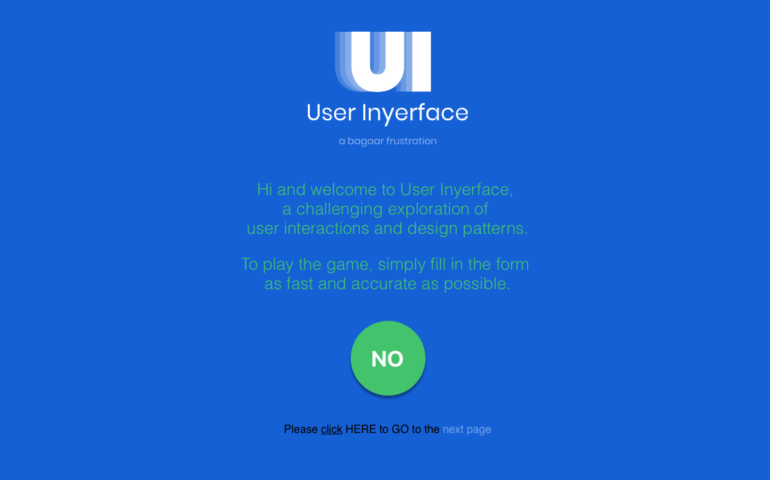
Behold, the most (intentionally) poorly designed website ever created
The site from a design firm upends conventions to become hilariously unusable. You know something's wrong right away on the first page. Why does this button say "NO" instead of "YES"? And one thing you can't tell here: hovering on the thing you actually have to click ("here") doesn't change

