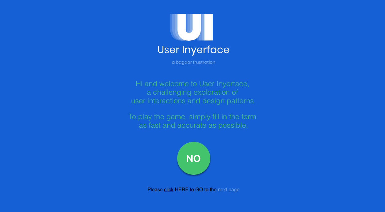
Sometimes we take Web and user interface design for granted—that’s the point of User Inyerface, a hilariously and deliberately difficult-to-use website created to show just how much we rely on past habits and design conventions to interact with the Web and our digital devices.
According to the design firm Bagaar’s blog:
Over the past decennium, users have grown accustomed to certain design patterns: positions, colours, icons… Rather than looking at a UI, users tend to act instinctively and take 90% of an interface for granted.
… But what happens if we poke all good practice with a stick and stir it up? What if we don’t respect our self-created rules and expectations and do everything the other way around?
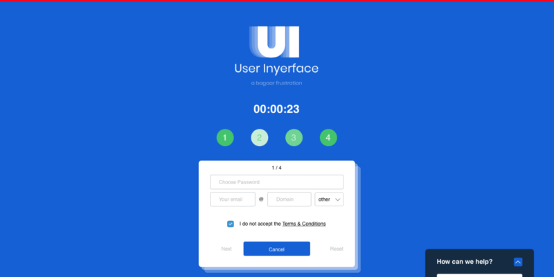
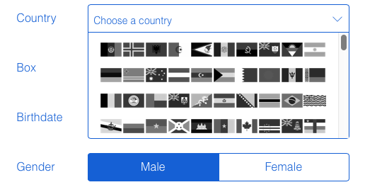
The resulting website is a gauntlet of nearly impossible-to-parse interactions that are as funny as they are infuriating. In one case, the colours for the male and female selection options in a personal info form are reversed compared to expectations: the white-backgrounded one is the selection, while the blue-highlighted one is the one you’re not picking—and there’s no non-binary option, either, of course.
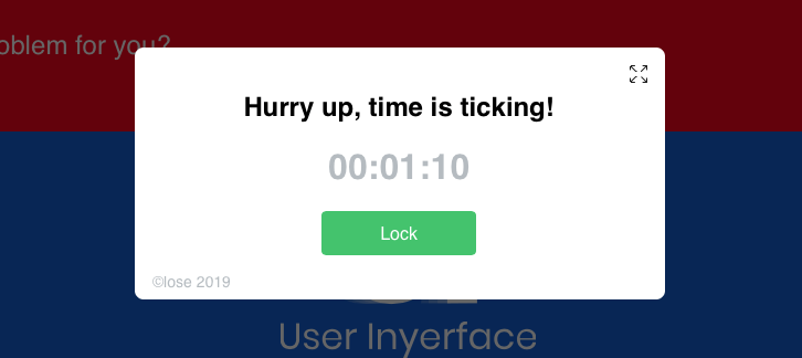
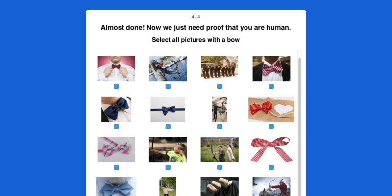
In another example, clicking to minimize a pop-up causes it to slowly—painfully—drop one pixel at a time out of view in a motion that Ars Technica’s own Lee Hutchinson called “majestic… it’s like a submarine slowly descending to the depths.” (He’s not making a compliment, really.) And as for the CAPTCHA, well, those are always a bit of a pain, but this one is a Dark Souls boss in UX form.
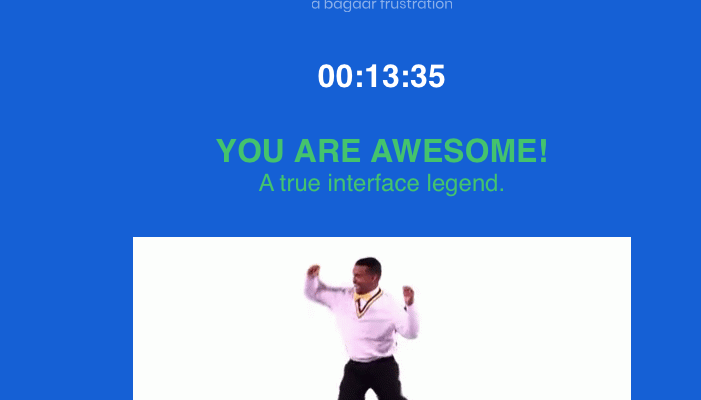
The page was shared on Twitter and Hacker News, among other places, by UX designers highlighting what a world without, well, UX designers would look like. And Inyerface thoroughly entertained Ars Technica writers who tried their hands at it today. It’s not pretty, but in this limited context, it is funny. Most people don’t survive the whole process the website is meant to carry them through, but if you like a challenge and more than a little pain, it is possible.
If you can’t make it, though, just look at our images above for a summary of what’s in store. And remember this next time you say a piece of software has “the worst interface I’ve ever seen”—we’re pretty sure that’s not going to be true anymore.
Listing image by Bagaar
Original Source: arstechnica.com


Team Arbree
August 1, 2019